Sale!
Blueprint – Next-Generation Blog & Magazine Theme
Original price was: ₹2,399.00.₹499.00Current price is: ₹499.00.
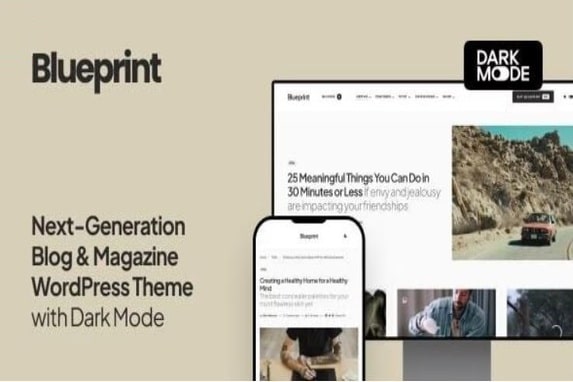
Blueprint Theme v1.0.5 is a modern and clean blog & magazine WordPress theme for modern publishers and bloggers. Turn on Dark Mode for a great viewing experience especially in low-light environments. Dark Mode is a dramatic new look that’s easy on your eyes and helps you focus on the content. It uses a dark color scheme and is activated automatically based on the browser’s preferred settings or manually with a toggle.
Description
Blueprint – Next-Generation Blog & Magazine Theme Features
- Smart Colors – When you select a dark background color for your header or footer, the text and links color will automatically change to white. You don’t need to set up a lot of color option, as most of them will work automatically based on your selection.
- Customize with Instant Live Preview – All theme options can be configured with the native WordPress customize feature. Forget the outdated settings pages and manually refreshing your page to see the changes. Preview all the changes live while configuring your perfect online media.
- Multiple Archive Layouts for Homepage and Archive Pages – Choose from different post archive layouts for your homepage and archive pages. Display your posts in grid, list, or full layouts.
- Multiple Page Layouts – Select the matching page layout for your homepage, archives, posts, and pages. Display a sidebar on either the left or right side or use the full-width page layout for your content.
- Super-Fast Mega-Menu – Showcase your recent posts with a thumbnail right in the menu dropdown. Don’t worry, the menu will not slow down your website, as the content is requested dynamically, only when a user hovers over the parent menu item.
- AMP Support – We have added styles for the AMP pages to match the main styles of your website. Simply activate the official WordPress AMP plugin to enable Google Accelerated Mobile Pages on your website.
- Exclude Duplicate Posts – Everybody knows, and Google, in particular, that duplicate content is bad. Avoid having duplicate content on your homepage by excluding featured posts from the main archive with a single click.
- Google Fonts – Create different styles with 800+ Google Fonts supported. Simply select the desired font from the dropdown and preview it instantly on your website – no more confusing CSS rules or code snippets.
- Additional Content – Ever wanted to place an ad spot underneath your header? Or a short description before the featured posts section on your homepage? A subscribe form below post content? With our signature feature you may insert any content into different template parts without changing template files or overriding templates with a child theme.
- Smart Sticky Navigation – Increase mobile users’ viewport by displaying the main navigation only when they scroll up. Or force the menu to stay sticky all the time. Or disable the feature completely, it’s up to you! Enable either of the three options in theme settings with a single click.
- Sticky Sidebar – Make your widgets sticky when scrolling the page. Select from two options: either stick to the bottom edge of your sidebar or the top edge of the last widget. Increase your ad’s conversion by setting the ad as your last widget and selecting the latter option. Unlike other theme’s sticky sidebars, ours is enabled and doesn’t flicker on tablets or mobiles. By using the native browser’s sticky positioning, we created a sticky sidebar that animates gorgeously not only on desktops but mobiles too.
- Smart Multi-Level Menu – It’s you who decides how to structure your content. Our theme supports unlimited levels in your main menu. If there’s not enough space in the viewport to display a dropdown submenu, it will appear on the opposite side instead. And it supports mobile touch devices, too.
- Mobile Slide-Out Menu with Widgets – Display the mobile menu upon clicking the hamburger icon on mobile devices. You may also place social links, subscription form, Facebook fan page or any other widget on your mobile menu, just as in a regular sidebar.


